
- 7 min read
- Coworking and events
- Creative workspace
- Community
A rebuild around the booking journey
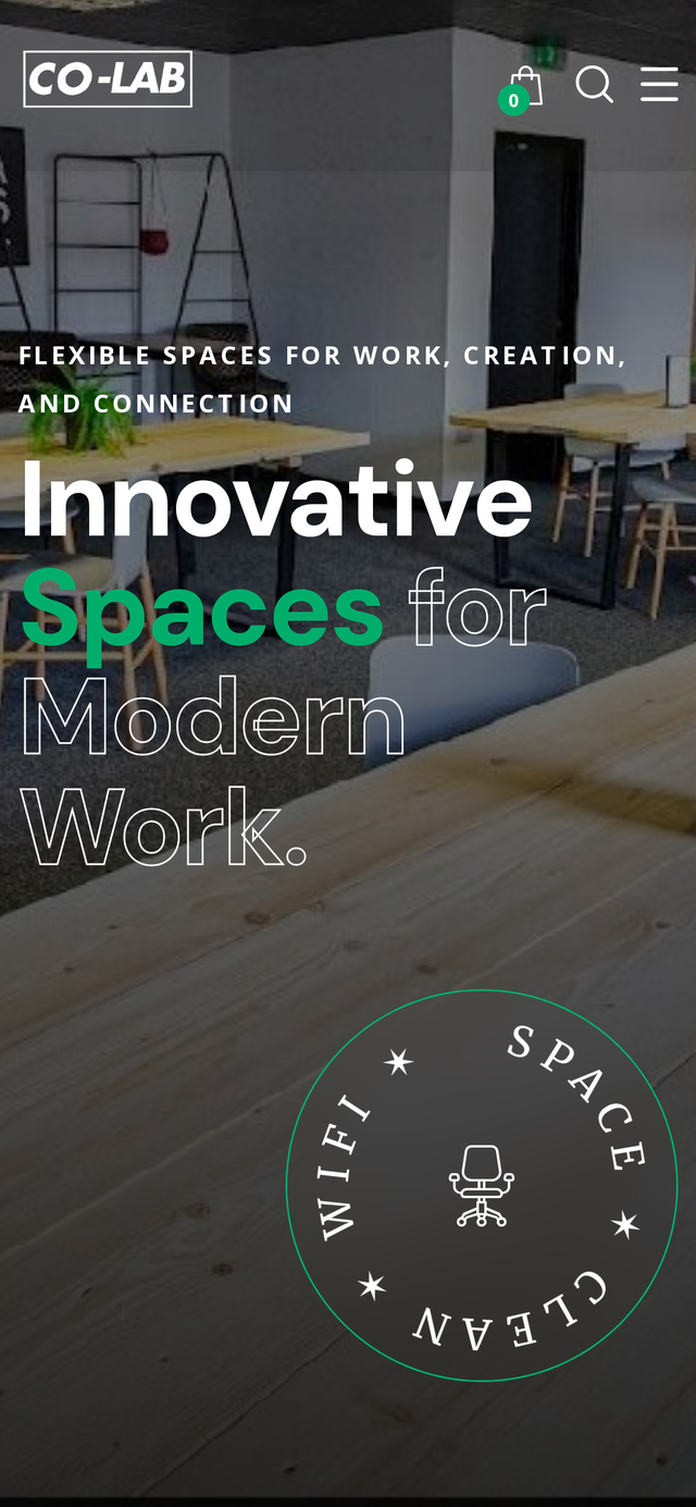
Co-Lab Creative Space had a strong physical offer and a website that quietly held it back. We refreshed the identity, redesigned the site around booking, and funnelled every enquiry into one workflow the team could actually run.
- Client
- Co-Lab Creative Space
- Sector
- Coworking and events
- Facilities
- Desks, podcast, photo, meetings
- Engagement
- Brand, website and automation
The brief in one paragraph
Co-Lab is a coworking and creative hub. It's also a content studio and an event venue, and the old site didn't make that clear. We tightened the identity, built a page for each space, and put a single booking flow behind the whole experience.
- Refreshed visual identity
- Mobile-first WordPress rebuild
- A dedicated page per space
- One booking and enquiry workflow
- Membership tiers you can compare
- Accessibility standards throughout
The shape of the engagement, at a glance
Coworking and events
Freelancers, small agencies and independent creators.
Brand refresh and website rebuild
With a booking workflow behind it.
- Branding
- UX and IA
- WordPress development
- Business automation
A small operations team
Managing a busy calendar across four distinct spaces.
- Clarity
- Bookings
- Fewer questions
- Brand quality
Design, build, iterate
Launched and refined against real booking behaviour.
A strong space, a website that wasn't pulling its weight
Three things kept coming up in the first conversations. The offer was blurred across coworking, studios and events. Mobile visitors were bouncing before they reached an enquiry. And the team was answering the same booking and equipment questions all day.
None of that was going to fix itself. The physical space had grown past the website, and it showed on every page.
What we had to solve
A blurred offer
Coworking, podcast, photography and events all fought for the same slot.
Mobile drop-off
The old layout didn't survive a phone in a coffee shop.
Repeated enquiries
Membership tiers, kit lists and booking questions asked one email at a time.
Brand mismatch
The digital presence didn't do justice to the quality of the physical space.
Getting behind the enquiries the team was already fielding
We spent a day with the operations team going through recent enquiries and bookings. The pattern was clear. People wanted specific things. A quiet desk for a week. A podcast studio with the right mics. A photo space with enough natural light.
A generic homepage was making them work harder than they needed to. The fix was to give each space its own front door and to make sure the booking flow behind it felt as considered as the space itself.
If the site answers the routine questions before anyone has to ask, the team spends its time on the work only they can do.
A page per space, and a single booking flow behind them
A dedicated page per facility
Podcast, photography, meeting rooms and coworking each get their own front door with the right detail up front.
Membership tiers side by side
Hot desks through to dedicated desks, laid out so people can compare in one glance.
One booking workflow
Every enquiry lands in the same tidy inbox with the right context attached.
Mobile-first everywhere
Layouts designed for a phone in a coffee shop, not a laptop in a meeting room.
Design principles
- Show the space properly. Real photography, generous crops and layouts that let the studios breathe.
- Answer the technical question up front. Kit lists, lighting, dimensions and capacities on the same page as the enquiry button.
- Make the next step obvious. Book a tour, enquire, join. One primary action per screen.
What was built
Podcast studio page
Mics, interfaces and software listed up front, so producers can plan without asking.
Photography studio page
Lighting, backdrops and dimensions so shoots can be scoped remotely.
Meeting rooms page
Capacity, AV setup and layout in plain language.
Comparable membership tiers
Hot desks, dedicated desks and add-ons laid out for a fast decision.
Book-a-tour flow
A short, structured tour request that pre-qualifies before it hits the calendar.
Contextual enquiry form
Each space's page carries an enquiry form scoped to what the visitor is booking.
One inbox, many sources
Tours, memberships, studio bookings and general enquiries funnelled into a single workflow.
Automated confirmations
Instant receipts on both sides so nothing sits in limbo overnight.
Schema markup
LocalBusiness, Product and Event schema for stronger local search visibility.
A stack that fits the way the space actually runs
- WordPress
- Block-based editor
- Custom lightweight theme
- Accessible UI patterns
- Structured data (Schema.org)
- Responsive image pipeline
- GA4 with consent mode
- Automated email confirmations
- CDN-cached delivery
How the build actually ran
Enquiry audit
A day inside recent enquiries and bookings to understand the real demand pattern.Brand refresh
A tighter identity, a considered palette and photography direction that matches the physical space.Content and IA
A sitemap organised around facilities, memberships and events rather than a single flat homepage.Wireframes
Facility-first layouts with the booking journey mapped end to end before any visual work.Build in WordPress
A block-based build shaped for a small operations team to keep updated.Booking wiring
Enquiry forms, confirmations and internal notifications wired into one workflow.Launch and iterate
Live, then refined against how people actually behaved on the new booking pages.
The engineering baseline applied on this build
Mobile-first design
Every layout starts on a phone and scales up from there.
Responsive layouts
A fluid grid tested against real device widths, not just breakpoints.
WCAG-aware
AA contrast, focus-visible states and keyboard-operable menus and forms.
Semantic HTML
Proper headings and sectioning so assistive tech can navigate cleanly.
SEO foundations
Unique titles, descriptions and canonicals per route, with LocalBusiness schema.
Performance
Efficient image formats, lazy loading and metric-matched font fallbacks.
Considered visual system
A refreshed identity that matches the quality of the physical space.
Clear next step
One primary action per page, reachable with a thumb on mobile.
What launch actually changed
- Booking workflow
- Live
- Facility pages
- 4
- Accessibility
- AA
- Answers
- Faster
One inbox for tours, memberships and studio enquiries.
Each independently discoverable in local search.
WCAG-aware baseline across every template.
Membership and kit questions absorbed by the site itself.
The team now runs the space from one workflow, and the site does a much better job of matching the quality of the physical experience. Enquiries arrive already qualified, and repeat questions largely disappear.
What we'd carry into the next multi-space brief
Giving each space its own page did more for enquiry quality than any visual change. When a photographer sees "photography studio" as a distinct offer, the whole conversation starts in the right place.
Funnelling every enquiry through one workflow was the other change worth its weight. A small operations team can't run four inboxes; they can run one.
- Give each distinct offer its own front door
- Answer the technical questions before they're asked
- Funnel every enquiry into one workflow
- Refresh the brand only as far as the work needs
- Design for a phone in a coffee shop, not a laptop in a meeting
Content hub — Co-Lab Creative Space
Client: Co-Lab Creative Space
Industry: Coworking & Events
Project type: Brand refresh and website rebuild
Services delivered: Branding, UX/UI Design, WordPress Development, Business Automation
Problem
Booking enquiries scattered across inboxes and forms, and a brand that didn't match the quality of the physical space.
Approach
An enquiry audit, a brand refresh, a facility-first information architecture and a single booking workflow behind every page.
Solution
A mobile-first WordPress rebuild with a dedicated page per space, comparable membership tiers and a booking flow that lands in one inbox with the right context attached.
Outcome
A cohesive brand, a smoother booking experience for visitors and one place for the team to handle every incoming enquiry.
Key takeaway
A coworking brand only works when the digital experience matches the physical one. Give each space its own front door, answer the technical questions up front, and put one workflow behind every enquiry.
Lessons
- Give each distinct offer its own front door.
- Answer the technical questions before the visitor has to ask.
- Funnel every enquiry through a single workflow.
Continue exploring
Related work, thinking and services
Related services
Related insights
What's next
The roadmap beyond launch
Event listings
A first-class events surface for the venue side of the offer.
Members' area
A light portal for existing members with booking history and preferences.
Local SEO expansion
Facility-specific landing pages for paid campaigns and local search.
Community content
Short interviews with members and studios to widen the top of the funnel.
Running a space that deserves a better website?
If you're operating a venue, a studio or a members' space and the site isn't matching the work, let's talk about what a rebuild around the booking journey could look like.
Enjoyed this case study?
Share it with your team or save it for later.
Published Last updated