
- 8 min read
- Community interest company
- Wellbeing
- Accessibility
A calm digital home for a new wellbeing community
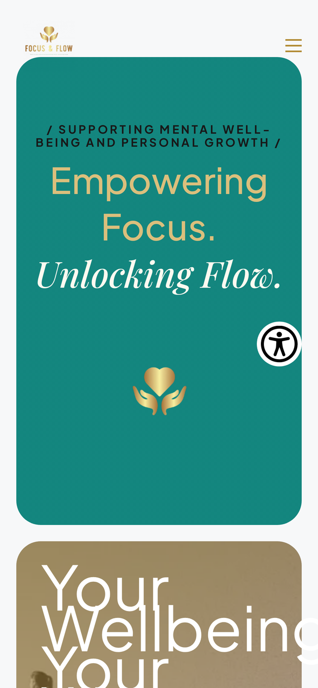
Focus & Flow CIC needed somewhere online that matched the care they put into their work. We built an accessible WordPress site around a clear member journey, with the automation to keep admin off the founders' plates.
- Client
- Focus & Flow CIC
- Sector
- Community Interest Company
- Focus
- Wellbeing programmes
- Engagement
- Website and light automation
The brief in one paragraph
Focus & Flow set up as a Community Interest Company around mental wellbeing, movement and creative workshops. They needed a first digital home that was calm enough to trust, clear enough to skim, and low-maintenance enough for a small team to keep updated between sessions.
- WordPress build the team can update themselves
- Accessibility-first design from day one
- Clear member journey across services and events
- Light automation for enquiries and onboarding
- SEO foundations and schema markup
- Mobile-first layout with fast load times
The shape of the engagement, at a glance
Wellbeing CIC
Yoga, Pilates, circles and creative workshops.
New WordPress website
First digital home for a newly formed organisation.
- UX and IA
- WordPress development
- Accessibility
- Business automation
- SEO foundations
A founding team of two
Practitioners who needed the site to work without their input.
- Credibility
- Clarity
- Less admin
- Accessibility
Design, build, ongoing care
Launched, handed over, then supported month to month.
A new organisation with no online ground of its own
For a wellbeing organisation, trust starts with how you look and read online. Without a site, Focus & Flow were leaning on word of mouth and hand-managing every enquiry. That's fine for the first few months. It gets fragile fast.
They also needed to point funders, partners and prospective members somewhere that felt considered. A social profile wasn't going to do that job.
What we had to solve
No online home at all
Nothing credible to send funders, partners or new members to.
Manual member admin
Every enquiry was answered by hand, with the same questions repeating.
A varied range of services
Yoga, Pilates, circles and workshops needed to sit together without competing.
A small team with no time
Whatever we built had to run without a full-time editor behind it.
Working out what the site actually had to do
We started with the founders and the mission, not the sitemap. Two sessions, a short audit of the competing wellbeing offer locally, and a plain-language write-up of who Focus & Flow are for and what would count as a good week for them.
The shortlist that came out of it was tight. Explain the services in a way people could skim. Surface the next event without a rebuild. Give people one obvious place to get in touch. Feel calm rather than clinical.
A website for a small team is only useful if it works when nobody's watching the inbox.
A layout that walks people from mission to next step
Homepage led by the people
The founders and mission sit above the fold. People book onto a class because of the person running it.
Programmes grouped by intent
Movement, circles and creative expression sit as separate hubs so visitors can jump straight in.
One clear enquiry path
Every page routes to the same considered contact flow rather than a scattered mix of forms.
Calm visual language
A soft palette, generous spacing and gentle typography that matches the work in the room.
Design principles
- Skim first, read second. Headings, chips and short paragraphs so anyone can find what they need in under a minute.
- Accessible by default. Contrast, focus states, keyboard flows and reduced-motion baked in, not bolted on.
- Mobile before desktop. Most local wellbeing searches happen on a phone, so the small screen was the primary canvas.
What was built
Service hubs
Dedicated sections for movement, circles and creative workshops with room to add more.
Events surfacing
Upcoming sessions and workshops are pulled into the homepage without manual edits.
Founder profiles
Named, photographed and given proper space. Trust for a wellbeing offer lives here.
Considered contact flow
One enquiry form with the fields that matter, feeding a tidy inbox rather than free text.
Newsletter opt-in
A quiet way to grow an audience that doesn't depend on social algorithms.
Clear next-step CTAs
Book, ask, join. Whatever the page, the next step is one tap away on mobile.
WordPress the team can edit
Blocks configured for how a two-person team actually publishes.
Automated confirmations
Enquiry receipts and internal notifications wired up so nobody's chasing.
Schema markup
Organization, LocalBusiness and Event schema so the right pages surface in search.
Tools chosen for a small team, not a big one
- WordPress
- Block-based editor
- Custom lightweight theme
- Accessible UI patterns
- Structured data (Schema.org)
- Responsive image pipeline
- GA4 with consent mode
- Automated email confirmations
- CDN-cached delivery
How the build actually ran
Founders' discovery
Two sessions on mission, audience and the practical operating shape of the CIC.Content map
A tight sitemap that gave each service enough room without cluttering the homepage.Wireframes and IA
Low-fidelity layouts signed off before any visual work, so the shape was right first.Visual identity
A soft palette, humanist type and photography direction pitched to the founders as a working document.Build in WordPress
A block-based build with the editing experience shaped for a two-person team.Accessibility QA
Contrast, keyboard flows and screen-reader spot checks across every template.Launch and handover
DNS, analytics and a short editor walkthrough handled together on the day.
The engineering baseline applied on this build
Mobile-first design
Layouts start at 320 pixels wide and are enhanced from there.
Responsive layouts
A fluid grid tested against real device widths rather than just breakpoints.
WCAG-aware
AA contrast, focus-visible states and keyboard flows on every interactive.
Semantic HTML
Proper headings and sectioning so assistive tech can navigate cleanly.
SEO foundations
Unique titles, descriptions and canonicals per route, with Organization schema.
Performance
Efficient image formats, lazy loading and metric-matched font fallbacks.
Considered visual system
A soft palette and generous spacing that reads as calm across every template.
Clear next step
One primary action per page, reachable with a thumb on mobile.
What launch actually changed
- Digital home
- Live
- Accessibility
- AA
- Repeat questions
- Fewer
- To grow
- Ready
A credible online presence for a brand-new CIC.
WCAG-aware baseline across every template.
FAQs and service pages absorb the routine enquiries.
New programmes and events slot in without a rebuild.
The team now has somewhere credible to point funders, partners and prospective members, and a website that answers the routine questions on their behalf. The back-of-house is quieter, and the front-of-house looks the part.
What we'd carry into the next CIC project
Two decisions did the heavy lifting. Leading the homepage with the people rather than the services, and treating the enquiry form as a proper feature instead of a footer afterthought. Both made the site feel like the practice.
We also learned to keep the editor simple. A small team will publish more if the CMS shows them fewer choices. Restraint in the admin is a feature.
- Lead with the people, not the services
- Treat the enquiry form as a product feature
- Give the editor fewer decisions, not more
- Ship accessibility on day one, not later
- Design for the phone in a coffee shop
Content hub — Focus & Flow CIC
Client: Focus & Flow CIC
Industry: Community Interest Company
Project type: New WordPress website with light automation
Services delivered: WordPress Development, UX/UI Design, Accessibility, Business Automation
Problem
A newly formed Community Interest Company had no website and no simple way to explain their wellbeing programmes beyond word of mouth.
Approach
A founder-led discovery, a tight content map, and an accessible WordPress build shaped around a two-person editorial team.
Solution
A calm, mobile-first WordPress site with dedicated service hubs, upcoming events surfacing, one considered enquiry flow and automated confirmations.
Outcome
A credible digital home for a new CIC, a much clearer route in for new members, and noticeably less manual admin for the founding team.
Key takeaway
For a small wellbeing team, the website has to work when nobody's watching the inbox. Design for calm, ship accessibility on day one, and let the site absorb the routine questions.
Lessons
- Lead the homepage with the people, not the services.
- Treat the enquiry form as a product feature, not an afterthought.
- Give the editor fewer decisions and they'll publish more.
Continue exploring
Related work, thinking and services
Related services
Related insights
What's next
The roadmap beyond launch
Programme expansion
New retreats and workshops slot in as their own pages without a rebuild.
Member area
A light members-only area for course materials and follow-ups.
Newsletter cadence
A regular round-up that keeps the audience close between programmes.
Content that ranks
Short, practical wellbeing pieces to widen the top of the funnel.
Launching or rebuilding a small-team website?
If you're running a CIC, a practice or a small studio, and the website has become another job on the pile, let's talk about what a calmer setup could look like.
Enjoyed this case study?
Share it with your team or save it for later.
Published Last updated