
- 14 min read
- Legal consultancy
- Brand and website
- Professional services
A trust-first digital home for a legal consultancy
Boadu Legal Services wanted a website as considered as the advice they give. Contemporary where it needed to be, traditional where it counted, and built for a single outcome. Booked consultations from qualified clients.
- Client
- Boadu Legal Services
- Sector
- Legal consultancy
- Coverage
- England and Wales
- Engagement
- Website and ongoing growth
The brief in one paragraph
A newly established legal consultancy needed to look, and behave, like a firm you'd trust with an immigration application, a complex commercial matter or a family dispute. We led brand, UX, accessibility, SEO foundations, WCAG-aware development and conversion strategy end to end. What we delivered reads as considered, calm and confident. The same qualities the consultancy brings to a first meeting.
- Full brand identity direction
- Information architecture and wireframing
- Accessibility-first component build
- Conversion-focused enquiry flows
- SEO foundations and schema markup
- Google Business Profile integration
The shape of the engagement, at a glance
Legal consultancy
Serving clients across England and Wales.
Professional services website
A brand-led marketing site with a structured enquiry intake.
- Brand strategy
- Website design
- UX and IA
- SEO foundations
- Accessibility
- Google Business Profile
A legal consultancy entering the market
Senior consultants, City-standard rigour, and a brand only just being introduced.
- Trust
- Professionalism
- Qualified enquiries
- Accessibility
Website and ongoing growth
Design, build and launch, followed by long-term iteration on the enquiry system.
Trust, or nothing
Legal buyers make binary decisions. Within seconds of landing on a firm's site they've decided whether it looks serious enough to hand over sensitive instructions, or whether to close the tab and move on. For a new consultancy without a decade of directory listings, the first-impression bar is even higher.
Boadu Legal Services was carrying real credentials into the market. Senior consultants, City-standard rigour, and a genuinely contemporary service model. But the existing digital presence was a placeholder. Indistinguishable from dozens of template law firm sites, no clear sense of who the firm was for, and no path between reading about the practice and booking a consultation.
Every design and technical decision on the project had to answer one question. Does this earn trust faster than the last one?
What we had to solve
Weak first-impression trust
A generic look-and-feel that didn't reflect the quality of the consultants behind the practice.
A fragmented service story
Six practice areas competing for attention with no clear hierarchy.
Enquiry friction
No obvious path to the highest-value action. Booking a consultation.
Discovery gaps
Little organic visibility for the practice areas the firm most wanted to attract.
What success looked like
Position the firm at the top of its market
A visual language and copy that reads as premium legal counsel from the first paint. Not a template firm.
Drive booked consultations, not clicks
A single, high-priority conversion path from every service page into a qualified booking form.
Compound organic visibility
An SEO-ready page structure, schema markup and Google Business Profile integration, so non-paid traffic grows month on month.
How UK legal buyers actually decide
We reviewed twelve competing UK legal consultancies and firms across immigration, commercial and family law. Mapping the homepage messaging, service architecture, enquiry flows, page speed and accessibility posture of each one.
Two patterns kept showing up. An indistinct visual identity, usually deep blue paired with a generic serif, indistinguishable from three other tabs the buyer already had open. And enquiry paths that ended in a phone number, with no structured intake, no clear expectation setting, and no proof of process.
Both were opportunities. We positioned Boadu with a distinctive editorial serif, a gold accent that reads as heritage without feeling old-money, and an enquiry experience that reassures before it asks.
Competitor findings
- 9 of 12
- used the same navy-and-serif visual template
- 7 of 12
- had no structured booking flow, only a phone number or a generic form
- 10 of 12
- failed a Lighthouse accessibility score of 90 or above
- 5 of 12
- had no organisation or service schema markup
Trust is bought in seconds and repaid in months. Every pixel on a legal site is either earning it or spending it.
A palette that reads as considered, not corporate
Colour
Consultancy Navy
#071A3D
Warm Paper
#F5EFE6
Heritage Gold
#C99A3C
Case Crimson
#8A2A2B
Typography
Contemporary consultancy,
traditional values.
Display, in an editorial serif italic
Body copy set in a neutral humanist sans. Chosen for readability at long paragraph lengths and clarity in dense form fields.
Body, in a humanist sans
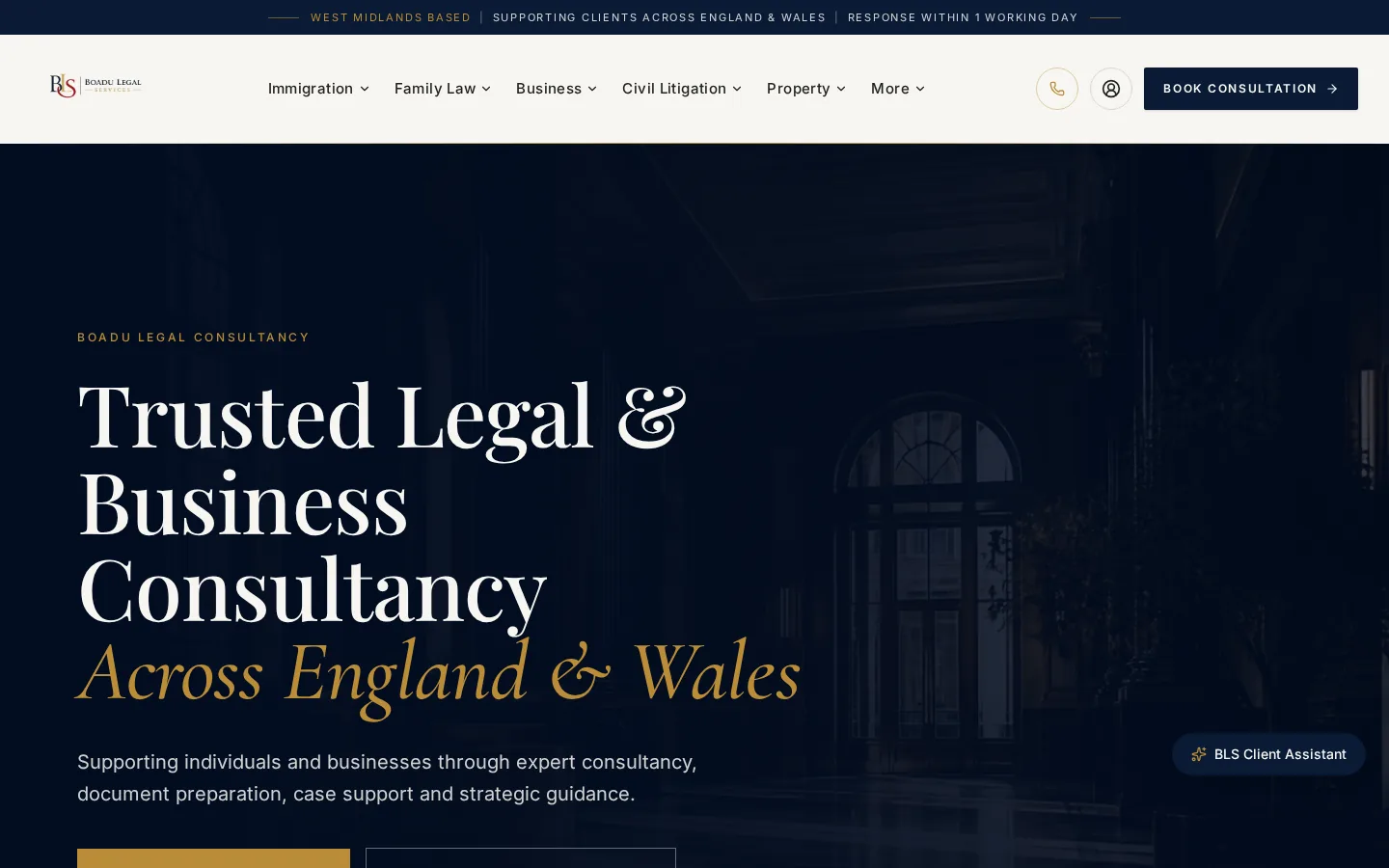
The gold accent is used sparingly. It's reserved for the primary call to action, the italic headline emphasis and the top service ribbon. Everywhere else the palette stays quiet, which is exactly what a legal buyer wants from a firm.
One page. One question. One next step.
Practice-first navigation
The six practice areas sit at the top of every page. Immigration, family, business, civil litigation, criminal and property. No hover-only menus.
Symmetrical service pages
Every practice page follows the same structure. What it is, who it's for, how the consultancy handles it, and how to book.
A single primary CTA
Book a consultation is the highest-contrast action on every screen, at every viewport, above the fold.
Progressive trust signals
Credentials, coverage area and response times sit in the top ribbon, visible before anyone commits to scrolling.
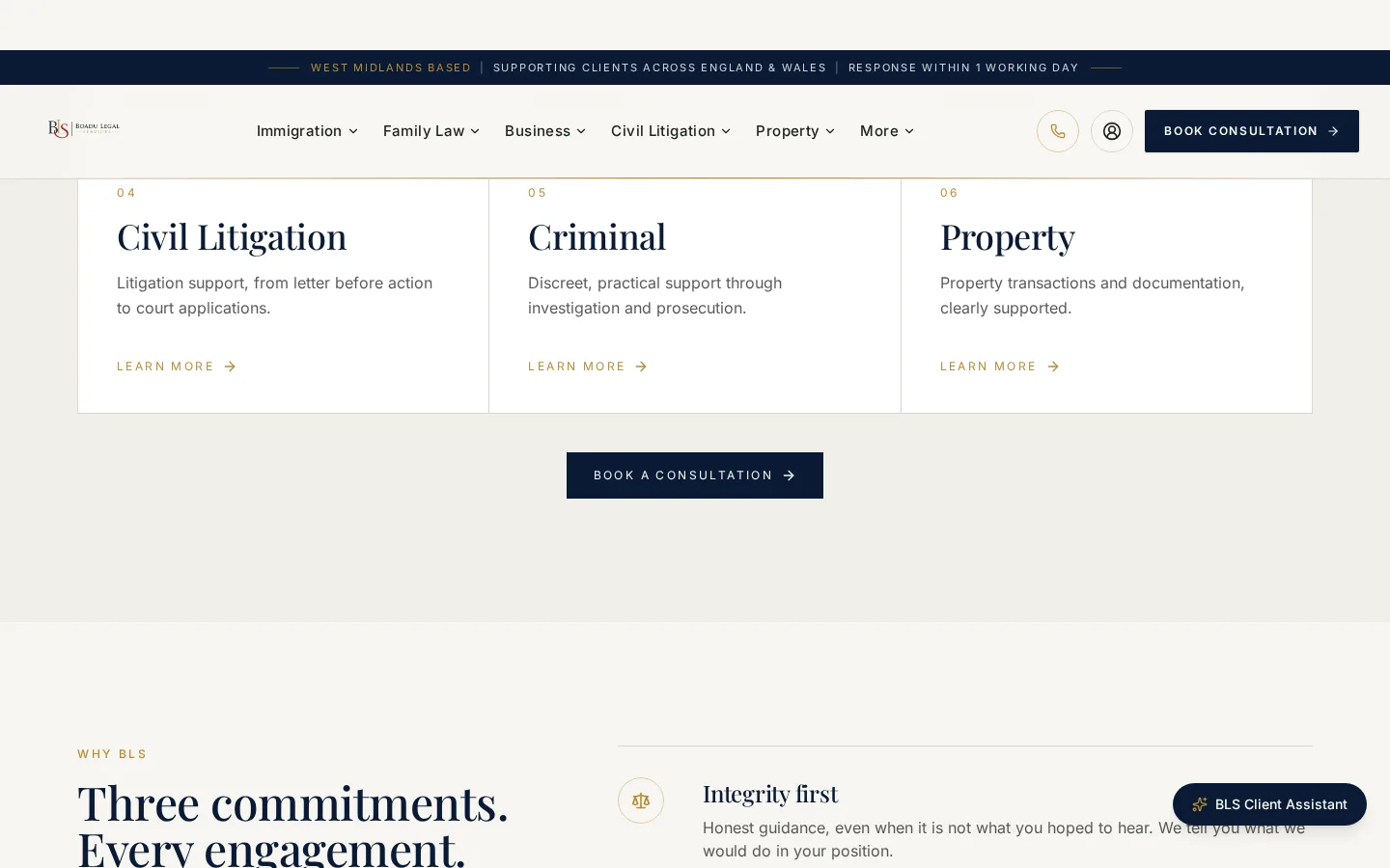
Practice areas surface as equal-weight cards, each with a numbered index. It reads as a firm that knows exactly what it does, not one still working it out.
Built with WCAG in mind, tested against real assistive tech
Accessibility isn't a compliance checkbox for a legal site. It's part of the trust contract. If a client with low vision, dyslexia or a motor difficulty struggles to reach the book-a-consultation button, the firm has failed a duty of care before the engagement has even begun.
We designed to WCAG 2.2 AA as the working baseline. Text contrast at least 4.5 to 1, a logical heading hierarchy, focus-visible states on every interactive element, and semantic landmarks (header, nav, main) throughout.
- AA-contrast palette validated across every component state
- Keyboard navigation tested end to end, menus and forms included
- NVDA and VoiceOver spot-checked on the primary journeys
- Reduced-motion preferences honoured in animation
- Descriptive alt text on both decorative and content imagery
- A skip-to-content link on every route
Structured for discovery, not decoration
On-page foundations
Unique title, description, canonical and Open Graph tags on every route. Semantic HTML5 sectioning and a single H1 per page.
Structured data
LegalService, Organization, LocalBusiness and BreadcrumbList schema, so Google understands the firm, its coverage and its practice areas.
Local and Google Business Profile
Google Business Profile wired into the contact experience, name-address-phone consistency enforced across every page, and an embedded map on the contact route.
From discovery to continuous improvement
Discovery
Two workshops with the founding consultants. Target clients, matter mix, positioning boundaries and the things they weren't willing to compromise on.Research
A twelve-firm competitor audit, keyword mapping and a plain-English review of the firm's existing enquiry material.UX strategy
Site map, primary journeys, measurement plan and success metrics signed off before a pixel was drawn.Wireframes
Mid-fidelity wireframes for every template. Home, practice areas, contact, legal, about. Reviewed with the partners.Visual design
A brand system, palette, typography and iconography presented as a working document rather than a static deck.Development
A component-driven build with accessibility and Core Web Vitals treated as continuous checks, not launch-day gates.Testing
Cross-device QA, Lighthouse and axe automated audits, plus manual assistive-tech spot checks on the primary journeys.Launch
DNS, analytics, Google Business Profile wiring and the 301 redirect map, all handled together on the day of go-live.Continuous improvement
An ongoing growth plan. Content additions, tracking refinements and small iterations on the enquiry flow, every month.
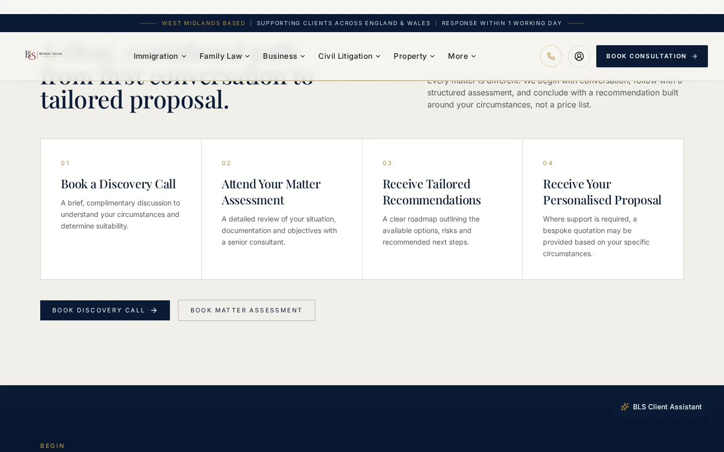
We designed the client-facing how-we-work section to mirror how the firm actually onboards clients. A website that describes the process honestly converts better than one that promises magic. Tap any stage on the left to see how it played out.
The engineering standards applied on this build
Mobile-first design
Every layout starts at 320 pixels wide and is progressively enhanced from there. Not the other way round.
Responsive layouts
A fluid grid, container queries where they help, and testing against real device widths rather than just breakpoints.
WCAG-conscious design
AA contrast, focus-visible states, semantic landmarks and keyboard-operable menus and forms.
Semantic HTML
Proper headings, sectioning elements and ARIA, used only where the DOM can't already say what it needs to.
SEO foundations
Unique titles, descriptions and canonicals per route, plus Organization, LegalService and BreadcrumbList schema.
Performance
Efficient image formats, a preloaded hero, metric-matched font fallbacks and route-level code splitting.
Security
HTTPS with HSTS, a strict Content Security Policy, a rate-limited contact endpoint and no client-side secrets.
Frontend architecture
Component driven, typed end to end, with consent-mode analytics and no third-party scripts loading before consent.
Conversion-focused UX
One primary action per screen, reachable with a thumb on mobile, and a structured intake instead of a bare phone number.
What was built
Sticky primary CTA
Book a consultation is one tap away at every scroll depth.
FAQ per practice area
Reduces email volume and pre-qualifies enquiries before they land.
Trust ribbon
Coverage area, response time and location, all visible above the header.
Practice-area micro-copy
Written to sound like the senior consultant handling the matter.
Editorial testimonials
Attributed and sector-labelled. No anonymous quotes.
Plain-English disclaimers
Regulatory footnotes readable without a law degree.
Fast, cacheable delivery
Aggressive caching, image-format negotiation and minimal JavaScript.
Schema.org markup
LegalService, Organization, LocalBusiness, FAQPage and Breadcrumb schemas in place.
Google Business Profile
Embedded map, consistent contact details and reviews pulled through.
Structured intake
Matter type, timescale and contact preference captured up front.
Response-time promise
Within one working day, stated clearly before the form is submitted.
Multi-channel contact
Phone, form and a secure client portal, presented in one clear stack.
Designed for the client on the train
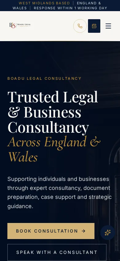
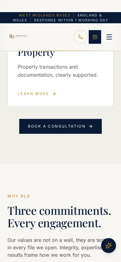
More than sixty percent of legal enquiries in the UK now start on mobile. We designed for the small screen first and enhanced from there.
Two decisions matter most on mobile. The primary CTA has to sit inside comfortable thumb reach in the bottom right, and the trust ribbon has to survive the initial viewport crop rather than disappearing into a hamburger. Neither is negotiable.
- Primary CTAs sit within comfortable thumb reach
- The trust ribbon stays visible above the fold
- A single-column layout with generous line height
- Tap targets meet the 44 pixel minimum
Fast where it matters
Core Web Vitals
The build targets an LCP under 2.5 seconds on 4G mobile and near-zero cumulative layout shift. Hero imagery is preloaded and served in efficient formats. Fonts use metric-matched fallbacks so nothing reflows when the display face swaps in.
- Efficient image formats served with a responsive srcSet
- Metric-matched font fallbacks, so nothing shifts on swap
- Route-level code splitting
- Third-party scripts held behind consent
Security posture
A legal site is a phishing target. We hardened the delivery stack to make that expensive. Strict transport security, a tight Content Security Policy, no direct SMTP surface, and rate limiting on the contact endpoint.
- HTTPS everywhere, with HSTS
- A strict Content Security Policy
- Rate-limited contact submissions
- No client-side secrets in the bundle
What launch actually changed
- Booking flow
- Live
- Accessibility
- AA
- Practice pages
- 6
- Response promise
- 1 day
A structured intake in place of a bare phone number.
WCAG 2.2 AA baseline across every template.
Each independently discoverable and indexed.
Committed publicly, tracked internally.
Where we can share metric uplifts publicly, we do. Where we can't, as with the volume and value of legal enquiries, we describe the operational change instead. The consultancy now runs on a website that carries its brand rather than diluting it, and on an enquiry system that feels like part of the practice rather than a bolt-on.
A different firm at first glance
Before
- A generic template look, interchangeable with forty other UK firms
- A phone number as the primary way to convert an enquiry
- Practice areas presented as a flat text list
- No structured data, and weak local visibility
- Inconsistent typography and no clear brand line
After
- A distinctive editorial identity that reads as senior counsel
- Booked consultations as the primary, measurable outcome
- Six equally weighted, independently discoverable practice pages
- Full schema markup and Google Business Profile integration for local search
- A single, coherent brand system used everywhere
Where the project could go from here
Lessons learned
Two things paid off out of all proportion. Writing service copy in the voice of the senior consultant handling the work, rather than in a marketer's, and treating the enquiry form as a product feature in its own right. Both lifted the perceived quality of the firm more than any visual change did.
We also learned to resist the urge to add more practice areas. Focus is what makes a consultancy credible. Six well-articulated areas beat twelve half-written ones, every time.
Future opportunities
- Practice-specific landing pages for paid campaigns
- An anonymised case-outcome archive as long-form SEO fuel
- A client portal integrated with the matter workflow
- Automated review requests through Google Business Profile
- Longer-form thought leadership on shifts in immigration policy
Tools chosen for outcome, not novelty
- A component-driven frontend
- TypeScript
- Semantic HTML5
- Accessible UI patterns
- Structured data with Schema.org
- A responsive image pipeline
- GA4 with consent mode
- Google Business Profile
- SendGrid for transactional email
- CDN-cached delivery
Content hub — Boadu Legal Services
Client: Boadu Legal Services
Industry: Legal Consultancy
Project type: Professional Business Website
Services delivered: Brand strategy, Website design, UX and IA, SEO foundations, Accessibility, Google Business Profile
Problem
A newly established legal consultancy needed to look and behave like a firm you'd trust with sensitive instructions, without the decade of directory listings older firms rely on.
Approach
A twelve-firm competitor audit, a distinctive editorial identity, an accessibility-first component build, a structured booking intake, and SEO foundations shipped as one integrated system rather than a website with a marketing bolt-on.
Solution
A legal consultancy website with a distinctive editorial serif, a gold heritage accent, six equally weighted practice pages, a sticky primary CTA, a WCAG 2.2 AA baseline and Google Business Profile wired into the contact experience.
Outcome
A digital home that carries the firm's brand instead of diluting it. A structured booking flow in place of a bare phone number. Six independently discoverable practice pages. And a public one-working-day response promise, tracked internally.
Key takeaway
For legal buyers, trust is bought in seconds and repaid in months. Every design and technical decision on this project answered the same question. Does this earn trust faster than the last one?
Lessons
- Writing service copy in the voice of the senior consultant, not the marketer, lifts perceived quality more than any visual change.
- Treating the enquiry form as a product feature raises the perceived quality of the firm.
- Focus is what makes a consultancy credible. Six well-articulated practice areas beat twelve half-written ones.
Continue exploring
Related work, thinking and services
Related services
Related insights
What's next
The roadmap beyond launch
Continuous optimisation
Iterate on the enquiry flow month by month, using real analytics. Small tests, compounding wins.
Long-form content
Practice-specific guides and immigration policy briefings, to widen the top of the funnel.
A case-outcome archive
An anonymised outcomes library, as long-form SEO fuel and social proof for buyers.
Google Business Profile
Automated review requests and richer local snippets, to compound organic visibility over time.
Planning a consultancy website or a brand-led rebuild?
If you lead a legal, healthcare or professional-services practice and your website isn't earning the trust your work deserves, let's have a proper conversation.
Enjoyed this case study?
Share it with your team or save it for later.
Published Last updated